Game interfaces
The interface is the mechanism by which the player and the game interact -
covering all the means used to convey information to the player and
all the means used by the player to control the game.
The effectiveness of the interface has a tremendous impact on
the playability of the game, and is often the make or break factor
with an otherwise solid game.
The interface plays a major role in shaping how the user thinks
about the state and operation of the underlying game - guiding a player
towards relevant/available information and choices, and presenting them
in the context of the game world.
A poor interface tends to distract the user from the game experience,
while a good interface blends seamlessly into the action.
A core part of the visual interface is dependent on the graphics
engine, and what kind of a perspective it provides the player on
their game world.
- Example perspectives include first person, over-the-shoulder, top-down,
side, third person, and isometric (3D from fixed raised position).
- Different perspectives have different strengths in conveying
information to the user, but also create different challenges
in displaying the game environment efficiently and effectively.
(Issues such as clearly portraying scale and position for a 3D
world on a 2D display screen, handling hidden objects, rendering
the images efficiently, etc.)
Another core part of the interface is the collection of input/output
mechanisms it makes use of.
Some of the most common data and control mechanisms include
Input
- data entry using the keyboard
- command/option selection using keyboard shortcuts or
mouse/joystick buttons
- navigation through the game control systems using
menus, tabs, hyperlinks, drop down lists, etc
- selecting actions/locations/objects using the mouse or joystick
(clicking on buttons/objects/locations, hovering over
items, dragging and dropping, manipulating sliders and
controls, etc)
Output
- On screen text
- Popups (messages/questions/tool tips)
- Images, graphics, and animations
- Audio: sound effects, dialogue, background music
- Force-feedback
In these lectures we'll consider several sweeping areas of game design
Designing usable interfaces
One of the challenges of developing games is providing a user interface
that seamlessly fits with the game play and game world - something that
is intuitive to learn and to play, and
doesn't distract the player from their immersion in the game.
- Identify what the user really wants/needs to be able to do
(i.e. what are their tasks/goals, NOT what commands do they
need to enter).
Come up with a collection of game play tasks or goals,
and work out scenarios describing the situation and
objectives.
These will be used later as part of the testing framework -
walking players through the scenarios with your interface
to evaluate its effectiveness.
- Identify what the game system/engine can do that lets the player
accomplish their tasks/goals.
What interface elements, information, layout, etc can we use to
support the player's gameplay - providing them with just the right
amount of information and control at just the right points in play?
How does the user find their way to the right set of controls
to accomplish their task?
What visual/audio/other clues are there
to guide them in the right direction?
How difficult is it to learn/master just the core controls,
and how difficult is it to learn/master the optional ones?
- Establish measurable goals for usability: e.g. "The player should
be able to learn enough in their first ten minutes to play and win
a game on the beginner difficulty level."
Design your interface with your goals and scenarios in mind.
- Test and evaluate your interface based on your usability goals:
- Gather a collection of test individuals, representative
of your target audience, preferably people who have not
worked on/tested your system previously.
- Assign players different task/scenarios, and observe
how they try to carry them out
- how long does it take them?
- where do they get lost?
- how long do they have to stop
and think about different actions/choices?
- where do they refer to help?
- where do they do the wrong
action, select the wrong command, or press the wrong
button?
All these things tell you where the weaknesses in your
interface are:
- where things are difficult to learn or
remember,
- where the placement of controls is counter-intuitive,
- where the images or names for controls don't match
users' expectations.
- Review the session with the players after the session,
getting their opinions on
- what was good/bad,
- what was intuitive,
- what was clearly explained and what wasn't
- how do they think the controls, goals, or information
could be made clearer
- One way of getting "inside the players' heads" is to have
two players work together on each scenario, and listen to
their discussions about what they should do at each step.
This clearly shows how they are thinking about the way the
game and controls work, and can provide greater insight
into the strengths and weaknesses of your interface.
In "Design of Everyday Things", D. Norman suggests five guiding principles,
slightly modified below for the realm of gaming:
- Visibility - make the relevant parts are visible
- Mappings - provide clear relationships between
controls and actions
- Affordances - ensure the perceived use of an object is
clear and intuitive
- Constraints - prevent players from acting
in ways they shouldn't
- Feedback - report to the player what has been done
or what has happened
Throughout, we are striving to understand the player,
and provide simplicity and consistency in our interface.
Input, navigation, and control
Navigation and control are major issues in all games - determining how the
player can best instruct the game on their choice of actions.
As stressed earlier,
the primary focus should be that "form follows function"
- i.e. the design must come from the purpose, not the other way around.
Expectations
We need to understand the game player, and their expectations in
the way the control mechanisms are likely to work - understand
what your audience expects each control to do.
This includes not just the mapping of which controls are tied to which
actions, but how those actions take place. For example
- Does pressing a movement key move you a discrete amount,
or change your speed in that direction? (E.g. do you have
to hold the control to keep moving?)
- Do directional controls use the camera perspective, or the
perspective of the character? (E.g. does pushing the
left arrow cause the player to turn counter clockwise, or to
turn towards the left of the screen?)
In general, this is determined by their experiences with other games,
and tends to make innovation in control systems riskier - any really
new approach breaks with the patterns players have learned previously.
If you do deviate from industry norms, you need to ensure
the controls and behaviours are very intuitive - often using a real
life role or mechanism as a metaphor to explain the game behaviour.
Simplicity
Another significant goal is simplicity - ideally there should only
be five to ten core controls the player needs to remember to play the
game effectively.
There may be many additional/optional controls, but the core should
be simple to master/remember.
If there are multiple game modes, in which the controls are used for
different purposes, then the mappings of the controls need to be
as intuitive as possible.
For instance, suppose there is an offense mode and a defense mode,
and you have 10 buttons you want mapped to different actions in
offense mode than in defense mode. How do you decide which ones
should be paired up?
User participation exercises
There are a variety of exercises you can test out on user groups
to see what makes sense to them:
- For the dual mode example above:
show one column of offense actions
and one column of defense actions, and get them to draw lines
between the pairs they think should map to the same controls.
- To decide which keys/controls should map to actions in general,
show a column of actions and a column of controls,
and get the players to draw lines between the pairs they
think belong together.
- To decide which icons/images should be used for different buttons
or controls in the interface, draw a list of actions and a list
of images (possibly with more images than actions) and let them
again match the pairs they think belong together.
- To decide which words/names/commands should be used for different
player actions,
draw a list of actions and a list
of words (again with more words than actions) and let them
match the pairs they think belong together.
|
Control tables
One common tool used to ensure you have mapped all actions to
appropriate controls is to lay out a control table.
For each game mode, list which controls correspond to each desired
action. This also allows you to check for consistency in how controls
are used in different modes.
| Control | Combat mode | Negotiations mode | Edit mode |
| <left mouse btn> | Select target | Select negotiations | |
| <escape> | Exit game | Exit to combat mode | Exit to combat mode |
| <Z> | Fire weapon | Accept deal | Save changes |
| ... etc ... | | | |
Navigation
As with the controls discussed earlier, we want to focus on expectations,
simplicity, and consistency when arranging collections of modes, menus,
or screens in the game.
The player should never be more than 3-5 clicks/steps away from any
action they want to perform, otherwise you are again forcing them to
remember navigation patterns and distracting them from the actual gameplay.
The player should always have clear and easy mechanisms to return them to
the "default" playing mode, and clear and easy mechanisms to exit the game.
As with the control tables, it is extremely valuable to map out a
navigation chart -- essentially a flow chart showing all the different
ways a player can move between all the different menus/modes/screens.
As with all controls, the commands or actions used for navigation should
be consistent across the different modes.
Conveying information
Aside from control/navigation, the major objective for the interface
is to convey just the right amount of information to the player
in a way they can use effectively.
The information you wish to convey may include
- audio/visual indicators that an action has begun or completed
- audio/visual indicators that the player has activiated a control
(e.g. pushed/released a button)
- visual highlighting of selected items or options
- game, room, scenario titles and logos
- controls to access menus, load/save, quit, restart, pause, options
- character/game status, logs, stats, history
- the main game display/map
- player chat/dialogue
- etc.
In many games the player must visually process a great deal of information
and react quickly - meaning the interface must present the information
in a way the player can grasp "at a glance".
Often this is best achieved by finding a good analog mechanism, annotated
with visual and audio cluse, rather than presenting the player with
blunt collections of data.
For example, if the player can have a health level of 0-120, should
we present that as a number, or as a health bar? Possibly colour coded,
green to indicate health > 60, red to indicate health < 30, and yellow for
health 30-60.
Sound effects can be added to indicate each time the player's
health drops, background music can be made "more tense" as the player's
health lowers, and animation clues can be added - such as the player limping,
panting, etc if their health is low. Each of these gives the player another
way of recognizing/assimilating a key piece of information.
One of the common mechansims used to convey complex collections of data
in games is the HUD (head up display), typically organizing all the supplementary
data around the edges of the game display.
As with keyboards and controllers, players will generally have pre-established
expectations for a HUD, based on experience with other games.
|
To guarantee consistency across screens, modes, or menus in your game,
establish a template -- the core items that will be identical on all
of the components.
To design the individual screens (modes/menus/etc)
simply add the specialized aspects to the stock template.
|
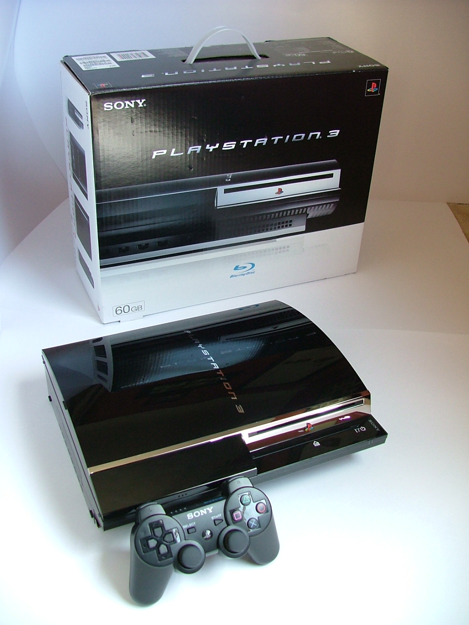
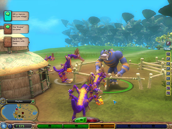
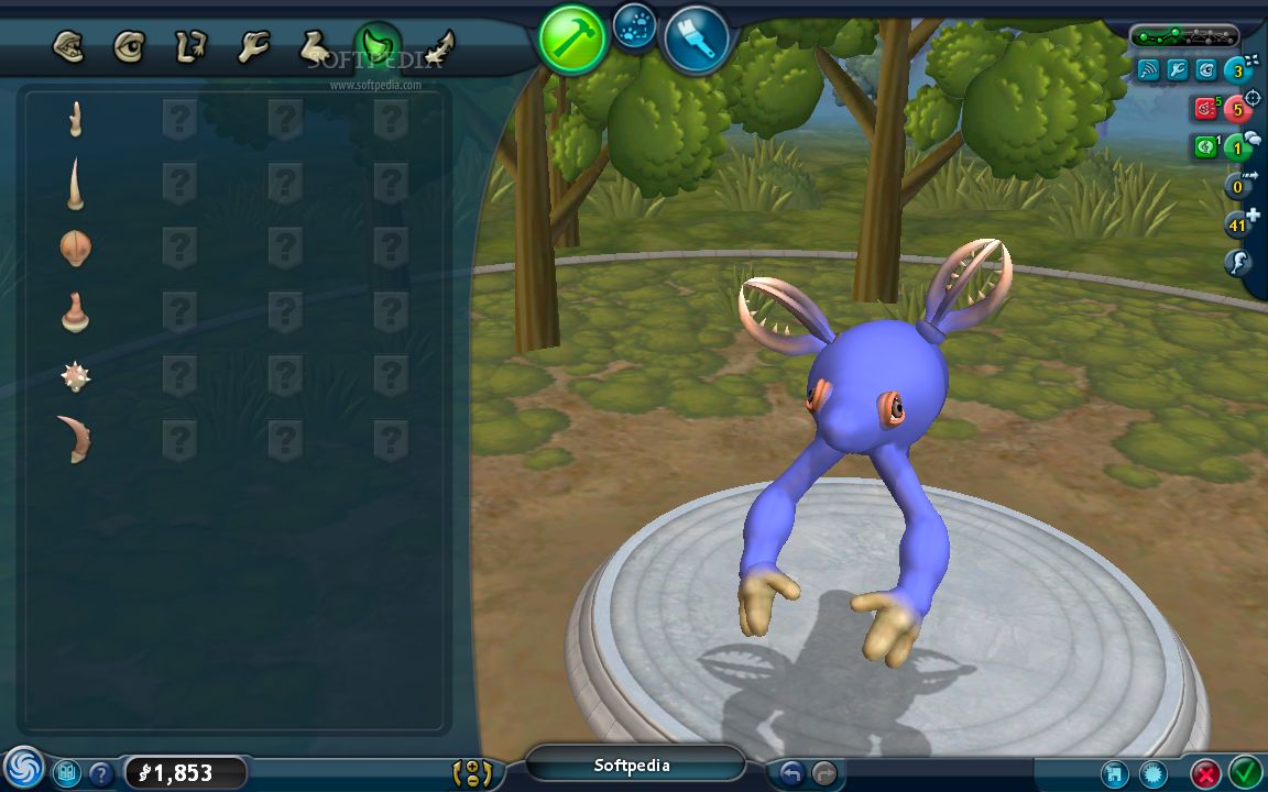
Examples